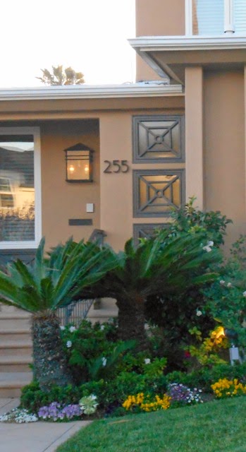
Particularly impressive were the upscale homes along First Street, a wide, tree-lined promenade a half-block from the ocean. Every home on First Street was a pristine example of architecture, each different from the next… dark, rich Craftsman homes, stately Italian Revivals, charming California Bungalows, romantic Spanish Haciendas, stylish Mid-Century Modern homes, strong International Style designs (from the Machine Age aesthetic), Greek Revivals, warm, old-school Georgian homes and of course, Art Deco designs. Long Beach is a major contributor to the collection of Southern California Art Deco structures, the most in the United States. OK, I wax… I guess I miss the eye candy!
However, with regard to “Curb Appeal,” one truth was evident in my old Long Beach neighborhood. These home-proud residents not only kept their structures in repair, but they did their research to understand the design of their home and to create the most appropriate exterior presentation possible. They know the landscape, the façade color and the entry all enhance the mood of the structure’s style. There were no careless choices in foliage and flowers, like hydrangeas and calla lilies in a Modern garden or a palm tree in front of a Colonial Revival home, nor did you see inappropriate paint colors, like a Craftsman in pastels or a blue Hacienda. These mistakes are confusing and create emotional sabotage.
In Southern California we are a sea of bedroom communities, where more homes than not are undefined, the result of builders taking creative license with the architecture: soft arches mixed with classic columns, Italian railings and wood shingled roofs, pediments and dormers on smooth plaster facades, or “The Box” with two windows and a door. Of course it’s easy when you have a fabulous, vine-covered Tudor to landscape, but what about the stylistically undetermined home in a tract with five rotating stylistically undetermined homes around it? Well, that’s where you come in Designer, helping your client find their “Curb Appeal.” It’s challenging, but lots of fun!
A good way to start giving the non-descript home some style is to determine its bent. Begin with the three basic style categories of Traditional, Transitional and Contemporary. Looking at the bones and the overall appearance, what style will it most easily receive?
Look for classic features you can play up with the “traditional” home like the black entry door, square panel planters and carriage lamp lighting for the “Town 'n Country” look. Or brickwork, flower boxes and shutters for a “Cottage.” If it’s blatantly contemporary, play it up for your client by painting it pale grey with white fascia and an orange, flat-face door, flanked with oversized planters and snake grass and a succulent landscape. If it has linear lines and “feels” contemporary maybe add a wainscot of ledge rock and a yucca tree with flax and grasses as a landscape…. you get the picture!
Also, don’t try and make a ballerina out of a football player. If it has a tile roof, it’s not a cottage. A used brick path won’t work on a Spanish Bungalow. Embellishing the house with style clichés won’t make it something it is not. Remember, the key features will tell you which direction works.

Easy fixes are the entry: changing out the hardware, house numbers, lighting, mailbox and painting the front door an accent color, then flanking the door or edge of porch with style-appropriate planters and foliage. Also, adding a little point of interest, like this stack of cross wood windows at the front door, or a window box of succulents or contemporary planter and abstract flax plant. Always look for interesting features that can be played up.
Of course painting the house is always a wonderful change. Use your “designer gift” and “see” the house in some unusual color combinations: in taupes or greens and grays, with a rich mustard or deep raspberry door. Sage is still a beautiful house color with cream and black accents on the fascia and molding with a red or navy blue door.
 |
| Just kidding! |


No comments:
Post a Comment