Tuesday, April 22, 2014

Hunters and Gatherers

OK, who’s a collector? Raise your hand! See, look around you. There are lots of us living amongst you minimalists and you “can’t stand the clutter!” freaks. Some of you collectors may be married to one who simply doesn’t understand that if one frog is cute, an army of frogs is absolutely adorable!

Collectors know that the need to collect is really not just  about the acquisition—it’s  about the journey, the mental registration that  alerts us to the possibility that a “Reed and Barton” jelly spoon in the grape pattern may be in that shop you just drove by. The alert that pulls us over to park at a yard sale or scroll on eBay 'til midnight… looking, seeking, searching, hunting for yet another one-of-the-same for your collection.

I personally am from a long line of “Hunters.” As I grew up, hunting for items in a like category was normal behavior. Today, several collections later, I am currently surrounded by my collections of mid-century pottery, glass paper weights, vintage broaches, mid-century cocktail shakers, toothbrushes, vintage salt dishes, world globes, china creamers… somebody STOP ME! Yet, I still get a rush when I stop at a shop or win a bid or cruise a yard sale and discover a “find” at a great price. It makes my day!

That said, the only reason collections work in my life is because of the way they are displayed. When integrated properly, collections can be a charming personal statement, a showcase of one of your interests, the results of your diligent hunt and an opportunity to live with what you love. You may have a client who is a collector. You would love to box up and hide her ‘kine of cows’ collection, but it is her home and her hobby, so consider the following display ideas before having that nasty cow conversation with her.

A good collection rule is: always display like items together.

Multiples set up a rhythm that controls the chaos and can be juxtaposed with the eclectic quality of a room. When you display objects in multiples, the aesthetic impact is more than the sum of its decorative parts. Physiologically, the eye is drawn to repetition; it registers this kind of regularity as it scans the room. The same applies to clusters and groups, as they anchor the visual flow from element to element. The display of a collectable should be in consideration of scale, style and mood of collection.

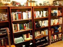
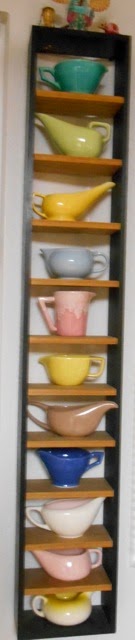
Once you have gathered the collection together, decide on the best application for the collectable. For example, ceramics are great in clusters on a bookshelf or as a table decoration. If the ceramic collection is a specific category, like pitchers or tea pots, line them up single file on a long shelf. For platters use shallow shelves or display them on plate hangers as art. For salt and pepper shakers use old “knick-knack” shelves with little cubbies for each pair of shakers. For my creamer collection I had little shelf units built to fit them, then hung the shelves in a patchwork on the wall (see creamer shelf, right).

Anything you can frame is good! A collection of “smalls,” like vintage keys, old jewelry, luggage tags, hat pins, buttons and beads, vintage lighters or compacts…etc., can become charming artwork when displayed in a shadowbox frame.

For glassware, like snow globes, crystal elements, decorated eggs, perfume bottles—anything with a precious quality—use a wall-mount display shelf unit, an étagère or a china cabinet with interior lights. These units were made for display. Glassware will sparkle and encourage nose-to-glass viewing by visitors. Also, consider using the cabinet units for little figurine items like unicorns or Hummel characters. Bottom line, if your client collects elephants and the herd is scattered around the house, round em’ up and display the entire collection on a shelf in the china cabinet. It will look interesting and lush verses lonely and corny.

Let’s face it ladies. Finding unique artwork or one-of-a-kind accessories (you'll never find them  at HomeGoods) is tough. Nothing is new and predictability in a design concept is the kiss of death. However, if your client just happens to collect antique evening bags or vintage maps, reconsider them framed and hung in your design. It’s customized for your client and becomes an accent NOBODY else has.

For collectors of like-subject artwork, again hang together in a group if possible, like this “dog paintings” collection seen here.


***
As promised, here are my tips on hanging a large group of various sized pictures on one big wall—good for “Family Galleries” and art collections!


1) AFTER, you have addressed all the framing and created a coordinated group of pictures, lay them out and divide into like-sized piles:  3x5, 4x6, 5x7, 6x8, 8x10, etc. Then pull all the oversized pictures—anything over 16x20—or pull the 3-4 largest pictures. These are your “anchor” pictures.

2) Hang the largest “anchor picture” in the center of the wall. Then lay the remaining two to three pictures on the floor, down to the right and left, to be hung later.

3) From your piles, create groups of two or three pictures that work together; i.e., three 4 x 6 pictures of your client’s three kids, or two 8 x 10 pictures of their grandparents. These will fill long or wide spaces. IF the frames are not the same that’s okay, but the size should be.

4) The shape rule for the overall picture group is the same as in designing a room—the eye should easily flow from picture to picture. So, always hang in a pyramid or sideways diamond (marquis cut). When the wall is particularly long make more “peaks and valleys” like a mountain range.

5) From your pile, remove good “topper pictures” to be at the top of your pyramid. Pick interesting frames, ornate styles or unusual shapes. These are a focal point.

6) If the images need a certain cohesion or timeline, like the husband’s family hung together, divide your pictures into the required order and lay along the wall, as the story goes.

7) Remember to mix it up and use all available sizes consistently. Don’t be stuck with a pile of little frames and three feet of wall left. Work right-left, right-left, so you don’t get lopsided. Lastly, make an invisible border line at the top and the bottom so you have horizontal balance, too.

GOOD LUCK DESIGNERS!

Monday, April 14, 2014

A Room of Her Own

I am a woman who supports women. I think women are amazing and I meet remarkable women every day at Design Alliance. Women who are loving wives, nurturing mothers and successful Interior Designers—multi-tasking at its finest.

During my design years I was invited into the homes of many remarkable women, interesting women who spent their days orchestrating the family lifestyle. It was not uncommon for these selfless women to abandon their own dreams to become the support system for their family, while their own talents and inspirations went dormant.

Sally was a client like that. Adorable, petite and gregarious, she had raised four boys (three offspring and one husband). Her youngest son, 28, had moved out about a year ago and Sally was ready to make some changes when I was called in to consult on a kitchen remodel.

I was oblivious to what lay ahead when I arrived at Sally’s 4/3 Ranch-style home. The garden was pristine, with a dichondra lawn. So mid-century! She was the first on her block to have the beds lined in annuals and hanging baskets flanking the front door. This yard had been lovingly maintained.

When Sally answered the door she was pure sugar ‘n spice, with a slight Texas drawl, a corona of platinum hair, sporting a pink top, mint green capris and white mules with three-inch heels that click/slapped as she walked. She invited me in to meet her house. It was not so colorful. This was a home that had survived 32 years of growing testosterone. It was a war zone where nary a surface had been spared the blows of boys in a brawl.

Sally then led me to the main event, the kitchen. When I saw the space I think I bowed my head and said a few words. This room had the pale, marred face of a healing accident victim… a boot toe dent in the refrigerator door, a dozen cracks in the counter tile, a pock marked vinyl floor and the oven door askew. I looked at little Sally and wondered how she came out unscathed!

I then started to take a few cabinet measurements when I opened the door to the broom closet and discovered stacks of cookbooks, maybe 40 or 50, on the floor.

“Sally what’s this?” I questioned, pointing to the piles.

“Oh, my cookbooks,” she said. “I love to bake. My mincemeat has won two ribbons,” she proudly stated.

“Wow!” I eloquently exclaimed. “Don’t let me forget to build you a bookcase above the desk I’m planning to replace your end-of-the-counter ‘phone center’ with!”

“Oh!” Sally squealed. “That will be lovely!”

As Sally and I toured the rest of the house, she spoke lovingly of her boys and husband Bud. I learned she met Bud in college, had received her Masters in Fine Arts and had minored in dance, with dreams to join a company. At night she would sit with Bud in front of the BIG SCREEN and knit blankets for the local shelter. She pulled a plastic bag from under the sofa to show me. I saw how they had turned her middle son’s room into an office for Bud and her youngest son’s room into a gym for Bud. Sally got her oldest son’s room.

“I’d like to see your room Sally,” I stated.

“But it’s such a mess,” she complained.

“I’ll try not to notice, lead the way!” I said, standing strong.  

She apologized over and over as we approached, then she opened the door and announced, “We call it the “Junk Room.”

I peered in and nodded, “Quintessential!”  And it was. There was a 6’ slider looking out on the pool, a missing closet door, piles of clothes, papers and books, an ironing board, a card table holding a small laptop, a sewing machine and an easel, set up over a laundry basket, supporting a painting in progress. I made some mental notes.

On the drive home I thought about Sally and how talented she is, as a gardener, baker, knitter, seamstress, artist and dancer. I thought about her passion to be creative and what joy it brought her, yet day-to-day she would hide her self-expression in the shadows, amongst the clutter of the “junk room,” in the broom closet, or under the sofa to gladly attend to her family’s needs. My next thought was that this is not a project JUST about this deserving woman’s battered kitchen. Frankly anything I did to that interior would be an improvement. This is “My Brilliant Idea” project!

So I designed the kitchen, drafted plans, compiled my samples and collected the appliance literature for my remodel presentation. Then, without solicitation or permission, I started designing Sally’s “Room of Her Own.”

She was in the largest of the three boys’ rooms, 15 feet’x13 feet, with the slider to the backyard. First, I replaced the sliding door with a pair of French doors, widening the casing with 4” molding that led into 4” base around the room. Then I took off the remaining closet door and designed a sewing area in one third of closet cavity with a permanent surface for her machine, lighting and her chair.  The remaining two thirds of the closet became customized storage, with stand-up canvas storage, basket bins for fabric, cubbies for her yarn skeins and drawers and cabinets for all her painting supplies.

I painted the room a beautiful soft pink/salmon and the moldings and French doors a pristine white. I set her easel near the window and added a stool. On the main wall I put a built-in daybed with bolsters on three sides and a ridiculous number of accent pillows. I set a distressed mint green end table with aqua lamp next to a comfy down club chair in a “Sister Parrish” cotton floral.

I added a small flat screen TV on the wall, an iPod for music and an additional book case for her favorite books and pictures of the beasty boys. I imagined the floor underneath the carpet would be hardwood, so the carpet came up and a soft, fluffy, area rug defined the seating area. It was scary-girly, void of boys. It smelled like a girl, all pink and flowery and lacy, full of cuteness and sweetness, fresh and beautiful… just like Sally.

Sally was over-the-moon excited about the idea and Bud footed the bill, as well he should.  A Room of Her Own was a big success for this altruistic, would-be ballerina and for me, it was an idea I applied four more times over the years—for a writer, a collector, an editor and a die-hard crafter.

These ardent women were easy to spot: dedicated, selfless and passionate about all that they do. Women like this may cross your path—deserving women who need a place to be with self. Maybe it is just a corner where you create custom storage, or a surface to draft or draw, a chair and lamp in which to read, a potting bench in the yard or a mirrored wall and a ballet bar—it’s just for them. Women, who in spite of all their creative suppression over the years, still have a sense of wonder and imagination with an ongoing need to create their vision… whatever it might be.
  

Friday, April 4, 2014

The Family Gallery

The most classically grand home I ever worked on was a hand-me-down—a project passed on to me by my dear friend Eva, an elegant, well-seasoned designer with an impressive body of work. Eva’s clients were upscale, from neighborhoods I had never heard of, so when she suggested I call this family from “Fancyland” for an appointment my first question was, “What should I wear?”  Eva assured me that I would be fine and although she found this challenge baffling, she knew I would know just what to do. So I dressed up and made the call.

It took an hour to get to my appointment and a grilling by the border guard before I was parked in front of this awesome estate. The architecture was neoclassic, symmetrical and grand, complete with a pediment atop a row of Doric columns. I rang the bell and “the husband” answered. Middle-aged, cheerful and chatty, he waved me into the foyer, no, the rotunda, with dome!! The floor had a beautiful round marble inlay design and the dome was a detailed leaded glass. A curving staircase flanked the round and led to a bridge on the other side of the dome. Supporting the bridge were two columns, which led to three steps descending into the living room. As the husband carried on with the back story of the French settee, I stood there wondering what my role was in this scenario. What could I bring to this iconic environment that this world traveler had not already considered?

In that moment I was led to the living room entrance. It was a huge, impressive space, maybe forty feet wide, with a wall of French windows opposite the steps, which looked outside to a court yard. It was old school formal. On one end was the fireplace, on the other end a grand piano and three seating areas in the middle. The lighting was recessed in a coffered ceiling, the upholstery was velvet, silks and tapestries... then I saw it, my purpose had been revealed. In this classically sublime space, every surface was littered with little stand-up framed pictures of their four children! It was wrong, specifically in this formal setting AND a pet peeve of mine…Eva knew that! 

I realized it would not be easy to suggest they banish their offspring from the living room. I knew I would need some life threatening reason before Mr. Lucky and his wife, the breeder, would surrender this showcase display of their proudest accomplishments. Oddly, these people hire designers to ensure they have a well-appointed interior, projecting a certain ambiance that reflects their privileged life. Yet, when you find this sea of frames in the middle of this fantasy you are slapped back into reality, like Christopher Reeve when he pulled the current penny from his pocket in “Somewhere in Time.” Dream over!!

It took two meetings to convince them to relocate this exhibit. I explained that a home this grand has visitors, meetings, parties, holiday gatherings, etc. You don’t have such an extraordinary abode and not show it off. Due to this truth, the living room would be considered a “public” area. Really, no matter what size the living room is, casual family photos are too intimate, particularly in such mass.

I also told them that these photos cannot be viewed properly broken up across the landscape. If left there they would need to station a Docent at the steps giving “Table Tours” to identify the child and event. Ultimately we moved them to a gorgeous, sky-lit hallway where Mama could guide tours down memory lane and tell the tale of their family. She was thrilled.

Everything has changed since “desk-top photo processing” has become the norm. Every little moment that moves us is now captured digitally. No more, “Oh, look at that, I wish I had a camera!” You do, and it’s in your pocket or purse—it’s called a phone!

It sets you up for a successful shot: lighting, focus, find the face and BAM, you are Ansel Adams. The other culprit is the readily available, affordable and adorable stand-up frame. You simply can’t buy enough. Well, it’s enough already.

Documenting your memories is a wonderful thing. Seeing our children’s evolution or our grandparent’s history connects us and gives our life substance. However, overkill turns your life into a flip-book. You would not write your life story with such redundancies so why do we need six pictures of Tommy at two when one cute one will do? Remember that a picture is worth a thousand words.

There are several appropriate areas in the home for groupings of family photos: any bedroom, the family or great room, an office or den, but the best gallery location is the HALLWAY. It’s a natural long walk, free of furniture and generally an area not “decorated.” This is my favorite area and no matter how small, a grouping can be hung!

Hands down the most effective application for me over the years has been the Family Picture Gallery. The task of gathering and framing all the photos that live in a box under the bed is overwhelming, so there they sit. For many, gathering and framing the photos of a lifetime and creating a cohesive timeline that tells the story of said life is priceless. It’s a fond memory, a validation, a diary of experiences, a foot print on the planet of all that really matters in one’s life. 

This effort on your part will give your client warm fuzzies again and again. You have the power to do that… so why wouldn’t you?

For those of you who feel intimidated by a pile of 100 framed photos and a long blank wall, I will give tips on how to hang a gallery or picture group in my upcoming  blog on “Collectors.”

Monday, March 24, 2014

Customers We Love to Hate: The Controlling Husband

All Designers know the client experience can be bitter or sweet.

Oft’ times a client becomes a lifelong friend and sometimes the client can become the project’s demise. In this series of “CLIENTS WE LOVE TO HATE” I will share some of the client issues I’ve encountered and the solutions that led to successful results. I welcome you to send in your own story with a “happy ending” to what could have been a design disaster due to an uncooperative client.  We could all use some field-tested ammunition when faced with a client positioned to sabotage your project. Knowing how to defuse potential trouble is all part of this crazy, people-loving business we are in!

The Situation


Meet Rita and John: early 60s, with two grown, married children.  Family home: 3,500 sq. ft. in upper middle class neighborhood. Proposed project: refurbish family/great room.

I meet with Rita, a lovely, timid, ladylike woman with a sweet nature. She explains what they want to achieve and then leads me to the “great room” and prepares our iced tea while I survey the area.  I assess… hmm, recover sectional, replace club chair, expand entertainment built-in for flat screen, buy new coffee table and OMG! Burn that recliner!  Our meeting was civilized and rather formal. Rita surrendered to my advice, was open to my suggestions and eager to review my samples in tow. It was a slam-dunk.

Design Challenge: The Controlling Husband


An hour had passed; enter John, “the husband,” fresh from the golf course. He plops down in the recliner. “SO, what’a you girls up to?”

Rita quickly injects, “This is Joy, the decorator that did Peggy’s house.”

“Peggy’s house? I don’t want you painting all the wood white in here,” John growled.

“I would never,” I mumbled and reached to shake his hand.

Rita quietly reminds him, “Remember we talked about this, John. I want a new print for the couch.”  “Look,” she says while flipping over the cushion to reveal a hole.

“Can’t you patch that?” John questions me.

“Well,” I begin, “IF I could find this fabric I could recover the cushion, but it still wouldn’t match because the entire sofa has faded a little and the cushion would look off color.”

“Well, how much is this gunna cost me?” John grumbled… and blah, blah, blah…you get the picture.

Fast forward 45 mins:  “OK,” resolves John. “You can recover the sectional and get Rita’s chair…”

Then, I made the fatal mistake. I felt it coming up but couldn’t stop it, the word bubble floated away from my lips… "So John, what about your recliner?”

John sits straight up exclaiming, “Whoa, whoa, no, no, no you will not touch my chair! This area here,” he gestures a box around his chair, “…is OFF LIMITS! Is that understood?” He glares at Rita and then throws one at me.

“Yes Sir!” I confirm, with a crooked smile. Rita quickly whispers sympathetically, “He loves his chair, it’s all broken in.”

“I understand. Not a problem,” I assure her. “We will work around it.” We shake on it and say our good-byes.

After leaving the meeting my head was spinning between the design concept and the sabotage of the dreaded recliner! That blue-brown-grey Poly and Ester, dirty-armed, grease-stained eyesore that is, naturally, the room’s focal point! I can go one of two ways here. I can be “Frasier” and let John’s recliner be the comic relief in the room or I can fight for the integrity of my design!

Action Called For


Fast forward, 3 months and 10 days. Rita and I worked on the great room together, scheduling our meetings around John’s work, poker nights and golf weekends. We re-faced and expanded the wall unit, recovered the sectional, replaced the club chair, area rug, coffee table and all the lighting. We scheduled the final installation during John’s four-day convention in Chicago. We bleached the ceiling beams, installed the shutters and painted the walls. I displayed the bookcase and hung the artwork and all of this around the blue-grey-brown beast! It looked beautiful and Rita was thrilled.

The Solution


Photo courtesy Leathercraft.
Oh, and the beast? Well it took a month, a neighborhood party Rita threw for John’s birthday and a visit from their son and daughter, all leading to the relentless ragging by friends and family about his ugly chair! Five months after project inception John caved and backed off his unreasonable demand. Out of respect for John I looked long and hard for a chair that satisfied both John and his great room.

Photo courtesy Leathercraft.
Fortunately the new “non-recliner-like recliners” were just hitting the market—chairs that reflected current styles and silhouettes but didn’t look like a recliner. At last the lonely world of the unyielding recliners had integrated the living space!

The Outcome


John was a happy man, enjoying his environment upgrade from a stylish prone position, and Rita got her just reward.

Photo courtesy Comfort Design.
The client issue of “the controlling husband” can go many ways—sometimes its money, a need to be involved in the design process or the injection of unreasonable or tasteless demands on your design. In John’s case it was a power play, a need to be considered in something he had very little interest in. Yet John dearly wanted a home that reflected his success in life, clearly not reflected in his chair, yet he still stood his ground. All this without considering the effort and strategic lengths we had to go through to complete this project to spare his ego.  It was old school: a woman getting her way by making a man think it was his idea. But, born a generation before the liberation, it was Rita’s only option. It was all she knew.

Despite the changing times, women like Rita—some of them very young—are alive and well today, living among us in these “old fashioned” relationships. I’m sure some have been your clients as well. So, while times have changed, sometimes the tactics for dealing with a difficult husband have not. 

Tuesday, March 11, 2014

Trust Me

I was 9 years old the first time I met a real Interior Decorator. It was after school at my “rich” friend Molly’s house. She lived in one of those perfect homes, always pristine, professionally decorated with invisible stanchions defining the “NO KID” areas. Molly’s mom, Mrs. C, had an appointment that day with the coveted, locally famous decorator Mimi Caswell. She told Molly we could watch, but to stay out of the way. So Molly and I perched at the top of the stairs and waited for this wonder woman while watching Mrs. C nervously align and fluff the perimeter of the living room.

When the bell rang and the door opened it was well worth the wait. Mimi Caswell looked 7ft. tall. She was wrapped in a big, soft, powder blue blanket, covering a black and white suit that looked like a PSA stewardess uniform and a shiny black helmet on her head. In reflection, I know now that her coat was cashmere, her suit was Chanel and her hair was Sassoon... and I’m pretty sure her lipstick was “Love that Red” by Revlon.

Anyway, she stepped into the foyer, dropped her coat on Mrs. C, who clutched it like a 3-year-old, then glided to the top of the living room. She stood there planted, feet apart, arms crossed and surveyed the space in silence. She took no notes, no measurements, she asked no questions. We all waited breathless. Then Mimi Caswell announced, “Now that’s a smart piece, we’ll keep that!” pointing to an English secretary, (I know now).

Then enthusiastically smoothing the air with her palms she stated, “And for your color scheme I like carnelian, olive and as an accent a pinch of puce!” she purred. “It will be stunning Mary, trust me!” She then twirled and headed toward the door. “We’ll clear the room Friday, Leo will make the arrangements,” she ordered while curling into her coat. Then before reaching the door she stopped and looked up the staircase at Molly and me, remarking, “Good afternoon ladies.” We sat speechless and she was gone.


For years to follow, Mimi Caswell, with her confidence and over-the-top presence, represented the interior decorator icon for me. I was now aware of their existence, and saw that same Caswell style reinforced with each sighting.  Like in the movies—“Breakfast at Tiffany’s” with Patricia  Neal or “Pillow Talk” with Doris Daythey were all dressed up in hats and heels, swing coats and girdles, meeting at the clients for a lamp delivery, to ensure proper placement, wave a glove and be gone.


What kind of power is that? The power Mimi Caswell had that left Molly and me speechless and had the home-proud Mrs. C ready and willing to hand over her house keys?

Artists have been beloved and feared through time, believing they have tapped their creativity and know something we don’t.  When presented with confidence, or worse, arrogance, it demands a certain respect. Like the Interior Design “style-makers” of the 1960s, with an unspoken patent on a “look” that became their legacy...and that “look” is for sale, with very little regard for the clients taste. “Trust me.” You were simply buying a promise of good taste and style at the cost of your own.

I believe all creators—artists, musicians, architects, chefs, sculptors, dancers and yes, even interior designers—create to appeal to our senses. They show us a new perspective and move us to feel. For designers the canvas is the space, our medium is the furnishings and our goal is an atmosphere—an environment that gives our client the desired feeling, through the color, style and texture of the selected elements. It’s their habitat, their abode, their safe harbor. It’s what makes them feel at home, and in 2014, achieving that is through good taste and style.

My years as a designer were dotted with what I call “fix-it projects,” when the client had hired a designer who disregarded their taste, their budget or their needs. They were left with $8k in full drapes they hated, or the budget went to a glass block wall and 4’ pivot door and no furniture. My challenge was working around furniture too big for the room, a trendy floor treatment (intention unknown) or simply no money left. 

Our project goals should not be a good portfolio picture or a funded canvas for our free expression; they should always be a happy, satisfied client. How the client wants to feel in their home, what the client needs to make their life easier, how to incorporate the ratty little chest her grandpa made or dad’s big puffy recliner—these are our challenges. 

When someone implies, “give me style,” “make me fabulous,” that’s a slippery slope. When we help our clients discover their own style, being fabulous will naturally follow. The days of, “It will be stunning, trust me!” are over. Engaging your client in the process not only lightens your liability, but makes this creation their own and they will be a big, proud advertisement for you! Trust me.

Monday, March 3, 2014

Ah... Here Comes the Sun

It was a cold and stormy day. A passing rain cloud casts a shadow across Design Alliance and the temperature keeps falling. I zip up my jacket and think warm thoughts…

I see myself reclining in the sun on my “Summer Classics” all weather, synthetic wicker lounge, and as I look down at my legs I wonder, “Where did I get this fabulous tan?” Then, I turn to summon the cabana boy for another mojito and I realize I’m still at D.A. working and this was all just a rainy-day-dream.

Photo courtesy of Summer Classics.
Daydreaming, ladies and gentlemen, is just one of the many benefits of outdoor furniture. Let’s face it.  We are in one of the most consistently “good weather” areas of the country and the best weather area in this state. Why shouldn’t we indulge in our wonderful weather?  Who better to create outdoor living areas than those who should—or can—go outside? Be it beach, mountain, desert or your own backyard, nature inspires us and evokes a sense of romance, so why not rejuvenate in your own private retreat?

Photo courtesy of Summer Classics.
These are the questions designers need to ask their North County and San Diego clients. This carefree weather environment is our county’s best feature and its residents ought to take advantage of it. An outdoor room can add 200, 300 or even 500 square feet or more of living area as a fantasy design or a natural extension of an indoor space, with features like built-in kitchens, fireplaces, bars and video screens. There are countless outdoor furniture collections available today, each creating an environment by design. Help your client define what environment would best serve them. Do they need more room?  A tranquil place? Or do they need to get away? Once you choose a destination, let the designing begin!

As you know there are hundreds of choices in outdoor furniture available, so no matter what the situation is outside your client’s abode—terrace or decking, pergola, gazebo, covered porch, courtyard, walled patio or simply the dappled shade of the big tree in their backyard—there is a collection to fit their needs.

Companies we like are:

Photo courtesy of Ratana.
Ratana for its iron clad, weatherproof, resin weave collections. Designs primarily in the wicker or rattan “look,” but made of resin and a lot of imagination. Their unique, clean, contemporary collections really stand out. Bottom line: Ratana’s product line is full of styles you simply don’t see everywhere!

Photo courtesy of Summer Classics.
Summer Classics: D.A.’s new favorite vendor! This beautiful, rich collection is versatile in the style and material mix, chosen to make each design statement sing. Using wicker, cane, rattan, teak wood, bamboo, cast iron and leather strapping for designs with spot on style. All pieces are made from weather resistant materials and look remarkably real. If you can’t find it, check out “Summer Classics.”

Photo courtesy of Lexington Home Brands.
Tommy Bahama Home: As a division of Lexington, a certain warmth and familiarity is evident throughout these exquisite designs from Tommy Bahama. The iconic styling of each collection shows a respect for the style’s integrity, right down to the indigenous natural materials used for table tops, chair legs and hand woven wicker. This collection is awesome. I’d be tempted to never let it outside—too pretty! But it’s made to withstand the elements in style.

Photo courtesy of Surya.
Outdoor Rugs we like for under the outdoor furniture collections: New to Design Alliance is Surya’s earthy, ethnic and interesting weaves. Coming soon, our new Surya display with 50+ new style samples! Another is Oriental Weavers’ large indoor/outdoor collection including some incredible Tommy Bahama patterns and the colorful, cool designs of Sphinx. Want to create your own? Try Creative Concepts from Capel—choose your field, choose your size and shape or specify your own custom dimensions, choose a border from over 100 fade-resistant fabric options or provide your own custom fabric and specify single, double or triple border—or no border at all.

Photo courtesy of Sunbrella.
Outdoor fabrics we like for the cushions and pillows: Sunbrella®. Duh…who doesn’t love a fabric that never fades! Check out the Sunbrella fabric lines from these vendors: Duralee: “Pavillon,” Kravet: “Soleil,” JF Fabrics: “Cabistyle,” Robert Allen: “Al Fresco” and Silver State. Plus, for rich traditional styling of quality indoor/outdoor fabric see Perennials “Uncorked.”

Okay Designers, what else do you need? You have access to the newest outdoor furniture, vibrant sunbrella fabrics, cool and stylish rugs and the PERFECT WEATHER CLIENT—a potential revenue stream you shouldn’t let pass you by. Outdoor living is the future.

Wait, I know what you need—some sales techniques for the big pitch on outdoor furniture!

How about a seat at our first D.A. "Lunch and Learn" Outdoor Furniture: The Next Design Frontier by the fun-to-watch Jim Warnock, sales rep for Summer Classics.

Thursday March 6, 2014 from 11:30 AM to 1:00 PM


Hope to see you in class.

Wednesday, February 19, 2014

Leaving Las Vegas... Not Yet!

Okay, Designers. Before we go, let’s review what the D.A. crew learned on this big adventure to the Las Vegas Market. First, let me remind you of our mission. We cleaned house here at Design Alliance, tossing dozens of out-of-date, neglectful and uncooperative vendors from our library of catalogs. We have made room for new vendors with a fresh perspective and a state-of-the-art design inspiration. We want to help you stay ahead of your clients  by keeping you abreast of the cutting edge trends in the design business.

The following are the vendors we found most exciting, with products and styles missing from our current library. As you review, please note who sounds good to you and with whom you might place an order.

FURNITURE COLLECTIONS


Four Hands:  Young, hip and urban. Very creative use of “other” elements, mixed with the common. Lot’s of natural accents like a slice-of-wood coffee table or a tree stump stool. Best industrial-influenced design seen at the show! Nearly every display had a vintage nod to the 50s or 60s or 70s in some application and all the clever lighting was unique to Four Hands. Overall the feeling was imaginative, designed and hand crafted. I choose this for its special accent pieces.

Gabby:  Transitional elegance, chic and slightly formal. Graceful lines in a pale palette, would describe the quiet Gabby showroom. A strong period furniture influence was seen in all of their designs as well as an extensive collection of antique “bench-made” case goods. Their seating collection shows lots of modern inspired silhouettes, the popular Italian arm on many chairs/sofas and classics like the Bergere chair. A handsome, stylized armoire, secretary or breakfront anchored every display. Overall the feeling was one of quality, class and tranquility. I choose this for its “on trend” transitional look.

Dovetail: Feminine, repurposed chic and new cottage. Dovetail had an atmosphere so distinct you could not imagine this furniture with any other. Every display was an effective, new, eclectic mix of styles that were spot on! Their artisans have mastered the art of “aging” woods, metals and fabrics to appear natural. In the weathered painted cabinet or the rough distressed tabletop you believed there was a history that got them here. Although they had some edgy, industrial pieces, I saw their strong suit in upholstery and dining sets. Overall the feeling was romantic, barefoot, gauze dress, lover, wine and strawberries. I choose this for all of the above.

Noir: Eclectic, intellectual, career city dweller. The NOIR showroom is misleading at first glance. You think contemporary, hip… but on closer examination you see the quintessential eclectic blend of choices in furniture, lighting and accessories. A large inventory of classic chests and cabinets, way-traditional bed frames and stylized, period sofas and chairs.  A unique group of transitional dining tables with raw trestle bases and hammered zinc tops coupled with antique period dining chairs like Chippendale, Emperor, British Colonial and ladder-back. An array of very contemporary bookcases and modern light fixtures like the “sputnik” or the alchemy chandelier, offered the eclectic twist. Overall the feeling was smart, confident and interesting. I choose this for the iconoclastic bend.


ACCESSORIES, ACCENT FURNITURE


Gold Leaf:  An embellishment source, for your display. Just full of yummy elements that were natural, textural, graphic, 3-D and ethnic. Woven papers, by the foot, would be fabulous framed. Cool sculptures to hang as 3-D artwork, beautiful woven baskets, unique bleached branches, and so on. Not a typical accessory vendor, but at times we need that special, unique element that could seal the deal on your coolness factor. Overall the feeling was “arty” one-of-a-kind. I choose this for the promise of uniqueness.

Global View:  Colorful, sculptural, ethnic design. Everybody’s favorite, it was just fun to walk in the showroom! A space divided into color collections with a sub category…series of shiny lime green ceramics paired with polished aluminum trays or shiny orange ceramics paired with monkey pod. Blown glass bowls, vases, sculpture and varied size balls glued to the wall as art. A large inventory of accent chests and consoles almost all reflecting some vintage design, as well as whimsical mirrors and wall hangings. An extensive collection of ethnic artifacts and useful elements. Overall the feeling was clean, new and creative. I choose this for its variety.

Worlds Away:  Elegant accents, gold leaf, mid-century. It’s Palm Springs 1963, it’s a white shag rug, it’s beehive hair with “Orange whip” lipstick. Worlds Away is feminine, shiny and carefree like;  a gloss teal lacquer entry chest with gold leaf legs,  or a gold and glass bar cart, parked under a silver leaf metal drum shade with Greek key cut-outs, or a pearly, Capiz shell hanging ball fixture. OR maybe one of their many gold, silver, metal or mirrored accent tables. Accent tables everywhere, clearly a trend! Overall the feeling was 1963, Pan Am Stew’s apartment. I choose this for the divorcee project.

LIGHTING


Jamie Young Lighting:  Creative, and sorta quirky. Lamps in every shape… balls, bells, barrels, jugs, jars and urns, made of clear colored or mercury lined glass, ceramic, wicker, wood, industrial metal or a stack of sliced horn.  Once you have selected a base, you pick your own shade, choosing from 38 shade shapes and 53 fabric choices, making your lamp truly one-of-a-kind.

Robert Abbey Inc:  A Designer’s lighting source. It appears they had handpicked the best from each of a wide range of lighting categories. In an effort to stay “on trend” they continue to work with icon designers, bringing to you a chic, strictly modern collection by Jonathan Adler, the elegant, classic, designs of Mary McDonald or Rico Espinet’s Stylish industrial creations. Overall, Robert Abbey lighting is a promise of quality.

AF Lighting: Lots of designer partnerships give AF a refined feeling, through thoughtful, edited lighting designs. Plus, the handy “series” groups, where they have gathered coordinated fixture styles of all types, into a collection. Great for a new home construction! AF has a strong transitional product line and a designer friendly attitude! Overall a first class staple source.


AREA RUGS


Feizy Rugs: (Pronounced Fay-Z).
The Feizy rug selection looks like quality, from the hand knotted silk and wool to the machine loomed PET, they look and feel rich. Their extensive traditional Indian rug designs are gorgeous and pricy. The transitional and contemporary collections are colorful and trendy in their designs. Overall some designs were so sublime that they were more suitable for framing than walking on!

Loloi: Their traditional rugs appeared to be ignored, as the LOLOI designers were busy creating their very hip and design friendly transitional and contemporary rug collections. The distressed “Nyla and Mirage” collection, the ethnic “Xavier” and the sophisticated “Sahara” designs all forgave the forgettable, traditional India classics. Overall, LOLOI may only be half useful?

Surya Rugs:  Made in Surya, India, all rugs are hand knotted, tufted or loomed. Colorful, tactile, cheerful and affordable, we love Surya! Also the home of poufs, ottomans, pillows, throws, lighting and artwork, plus… Design Alliance is the exclusive distributor in North County!